Is this a publicity photo from a new fantasy movie? Nope, it’s just a bit of Photoshop work! This is a composite of three images, and today I’m going to take you through the anatomy of how it’s accomplished.
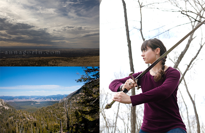
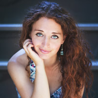
These are the original three images with which I started. At top left, we have storm clouds above Table Rock in Boise. At bottom left, we have a view of the Stanley, Idaho region as seen from the trail to Sawtooth Lake. At right, we have a fantasy-movie-inspired portrait (more from this session). I’m going to take the two images on the left and combine them to get this:
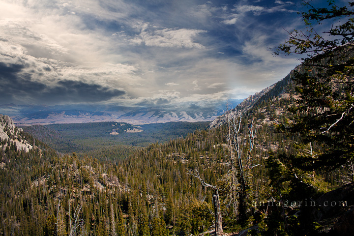
It’s rough, but the messy areas will be covered in the end. The next step is to add in our model:
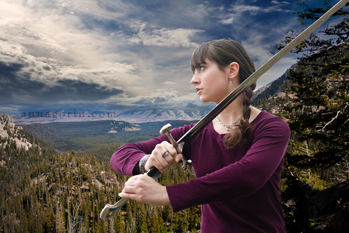
This is the toughest step in any composite: extracting the subject from the original background. The key? Masking by hand with a small brush with fairly hard edges, and a lot of patience. As you can see, even though it’s a clean cut-out, the new image doesn’t blend in the least. So for our next step:
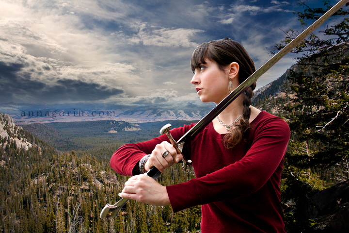
Increasing the shadows, highlights, and color saturation in the main image helps the images blend a little more. I also shifted the shirt colors to a deep red, which suited the fantasy theme I had in mind a little more. I want this to be a little more dramatic, though, which brings us to the next step: lighting effects.
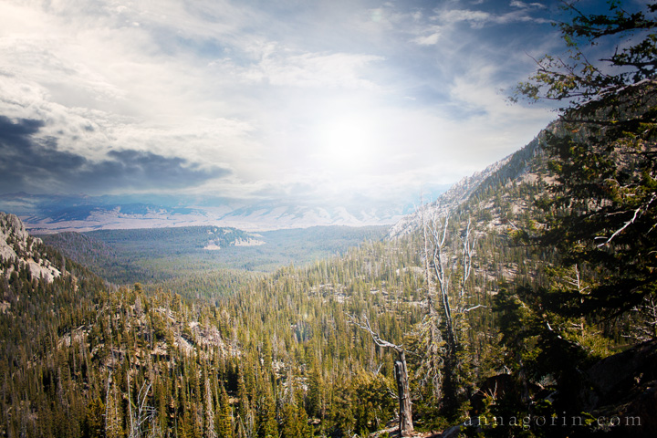
Photoshop’s lens flare filter is frequently maligned, but in this case it was perfect for adding in some dramatic highlights. Above is the background with a bit of flare. Don’t worry, our model isn’t gone, just hidden for now so you can see the background clearly. With the model added back in, it looks like this:
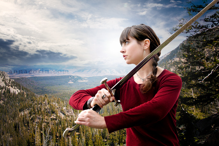
The composite is getting there, but it still needs a touch more drama in my opinion.

Bringing out the textures in the sky and adding a little more contrast to the model’s face did the trick for me. The blending is pretty much complete at this point, but I’m not satisfied with the colors. I want something more uniform and cinematic, for which I headed to onOne’s PhotoTools plugin and used a combination of Autumn, Cooling, and 85A Warming filters.
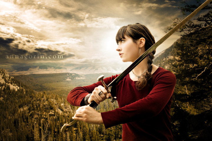
Better! But let’s add in a little more contrast and some softness around the edges to draw the focus to the center, using Black Soft around the edges and Green Velvet for the contrast.

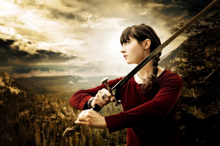
So close! A few more adjustments – a bit of glow, a tiny bit of sharpening to the model, and we have our finished product (click for large version):
Hope you’ve enjoyed this behind-the-scenes look!




4 Comments
This is absolutely amazing. You are absolutely amazing.
[…] you liked the behind-the-scenes look at how a fantasy portrait manipulation is created in Photoshop, you’re in for a treat today! Here’s the first installment in a two-part series of […]
Love your finished photo. Very dramatic.
[…] part I of this series of fantasy portraits shot by the Boise River, or the behind-the-scenes look at how a fantasy photoshop manipulation is composited? Then you’ll certainly enjoy part II […]